Strega contains star anise, cinnamon, juniper and mint, and is known for its signature golden color, granted by saffron. It is a nectar full of history and personality, which simply had to have a special container: indeed, Strega’s bottle has become an icon in and of itself over the years, thanks to a look that is as original and bold as the flavor of the liqueur inside.
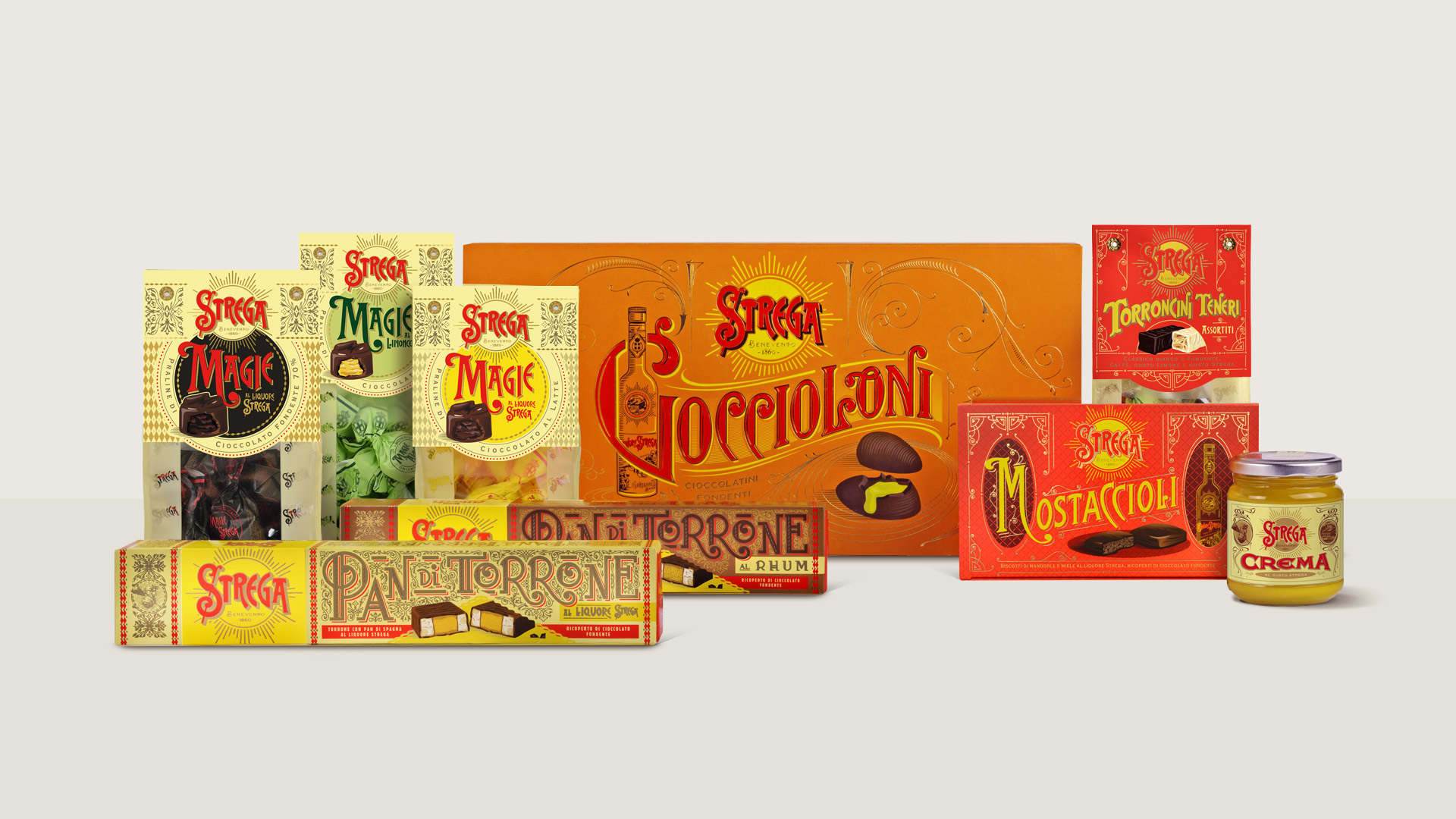
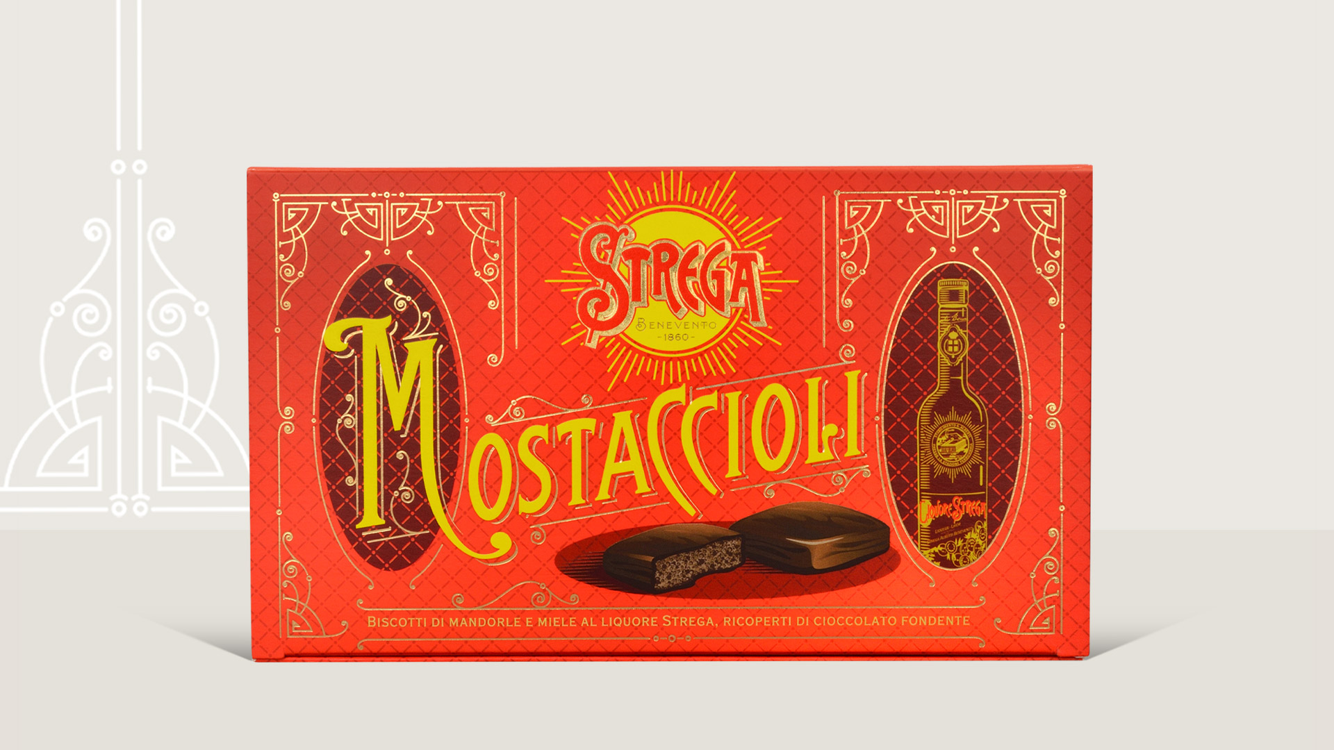
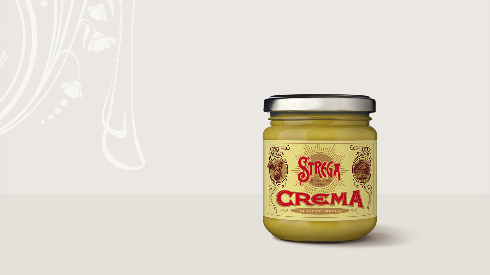
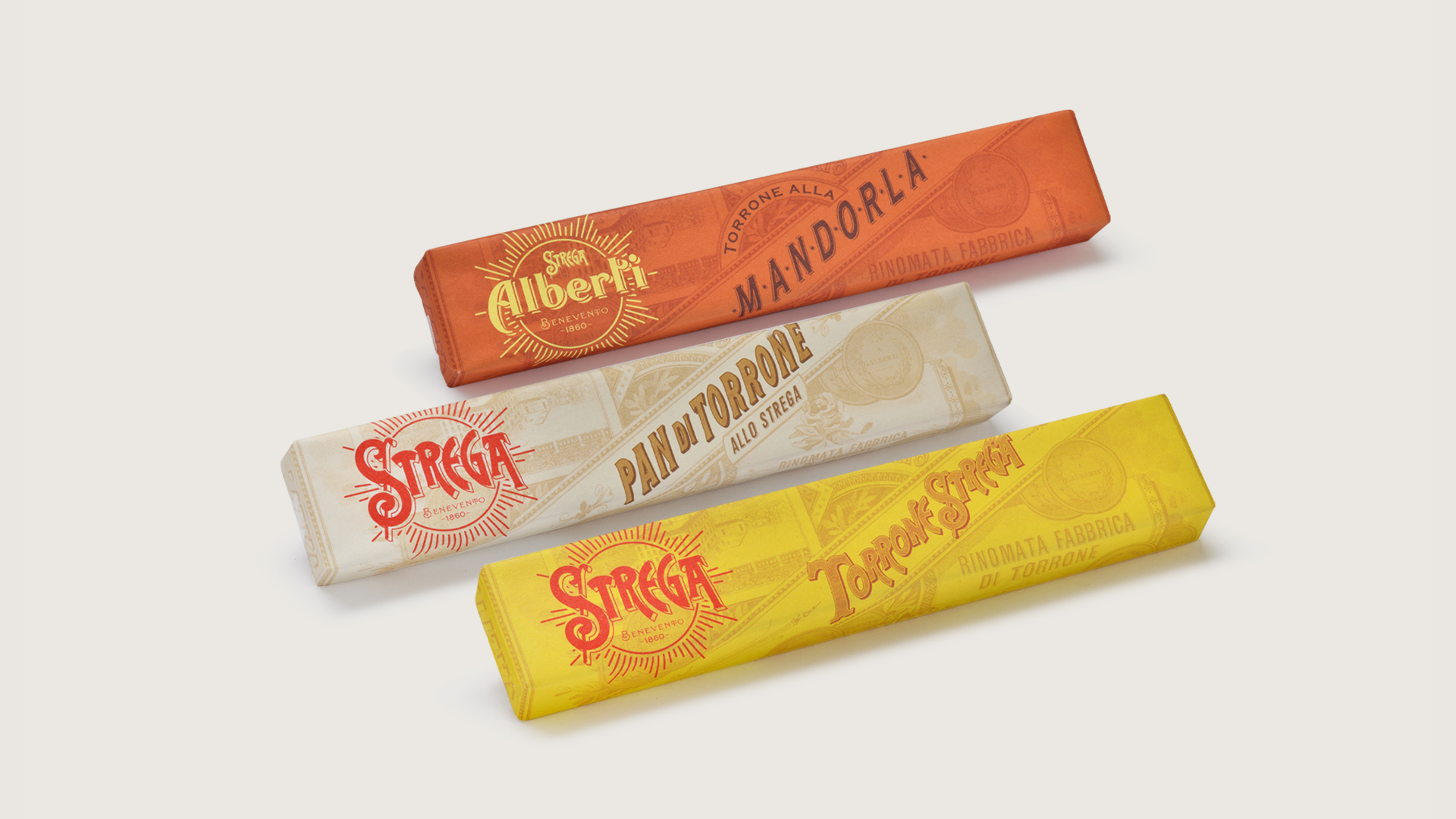
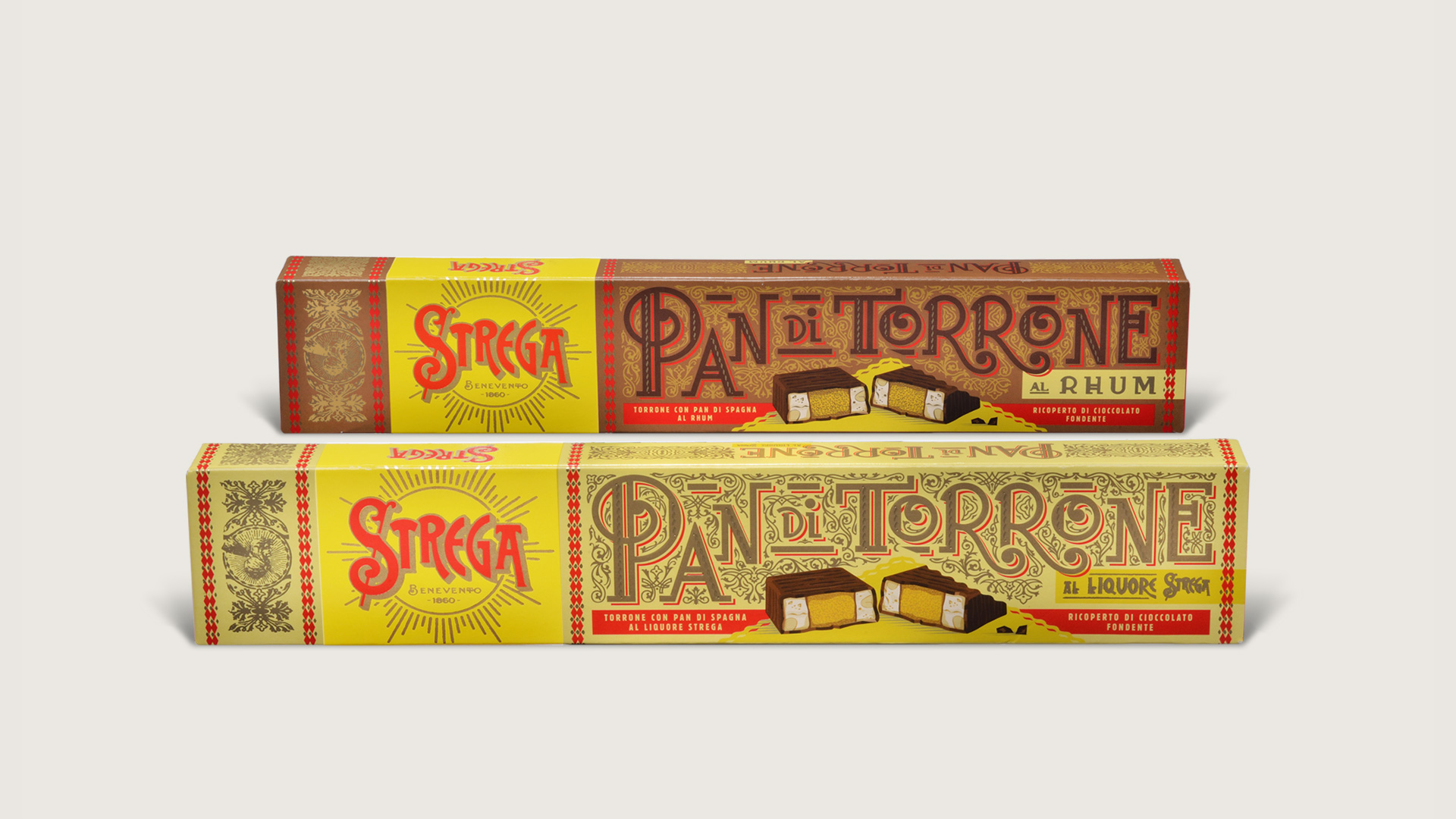
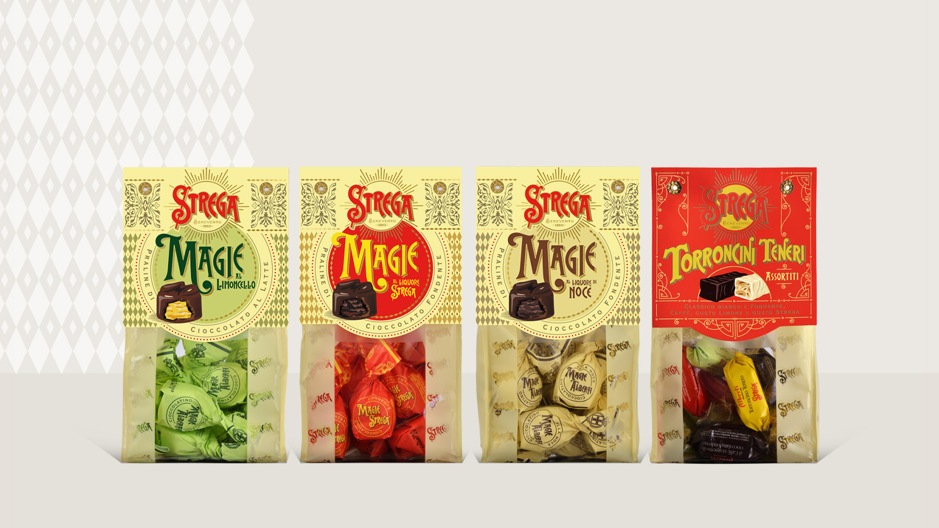
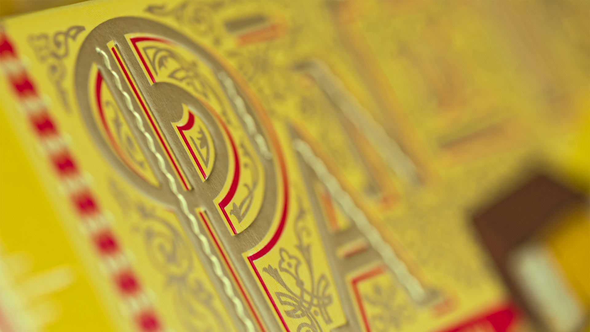
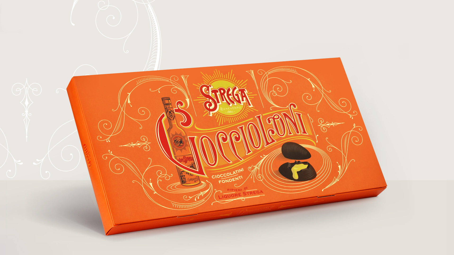
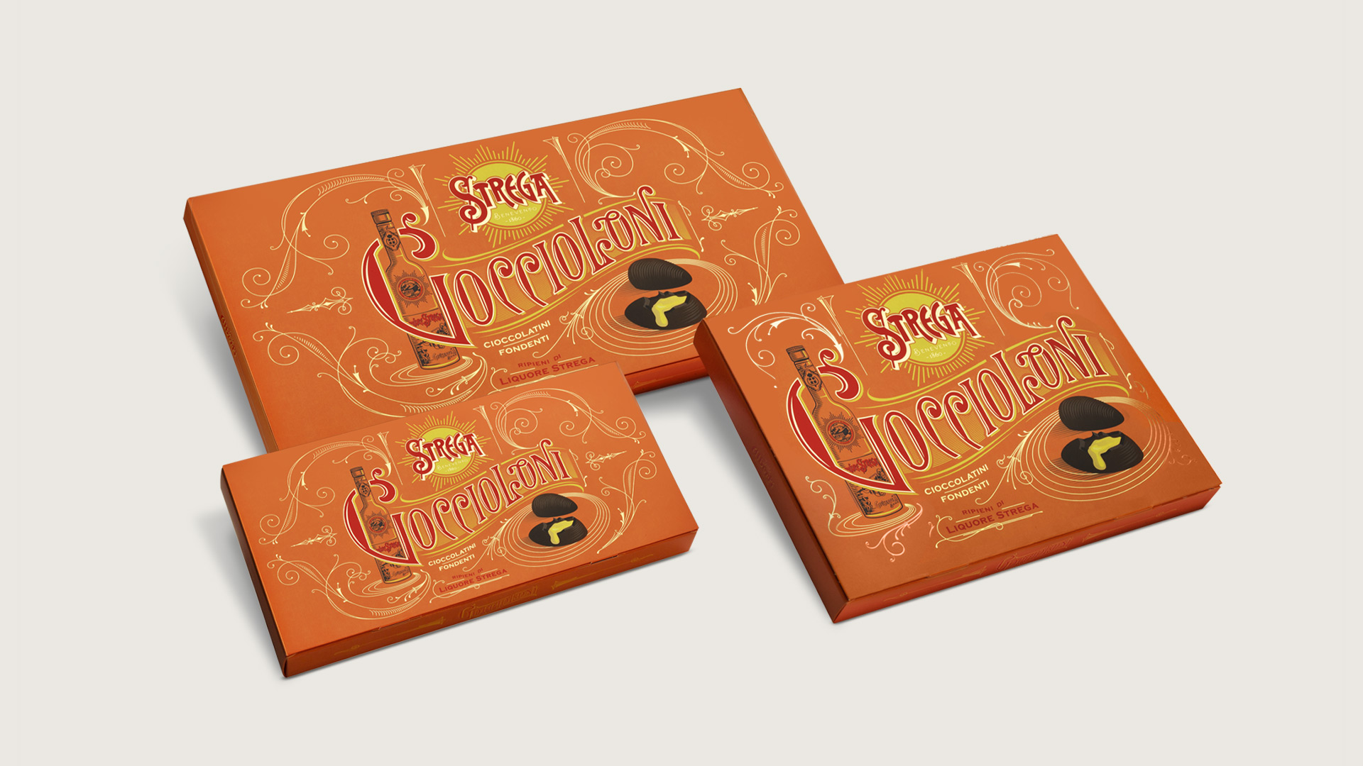
Strega entrusted Angelini with designing the packaging for its two ranges of sweets: Strega and Alberti. The goal was to differentiate the two, highlighting their specific features. Strega confectionary products are elevated by the flavorful liqueur, and stand out for their bold and strong character. The agency was able to translate their personality into precious packaging solutions, building a visual style that sets the range apart while still maintaining Strega’s historical legacy and heritage intact. The fonts used to identify the different products were painstakingly defined one by one, granting each specialty an identity of its own. Thus, for example we have Art Nouveau inspiring the box for Pan di Torrone, while Strega’s signature color palette of golden yellow and bright red was chosen to represent character and personality for Mostaccioli.
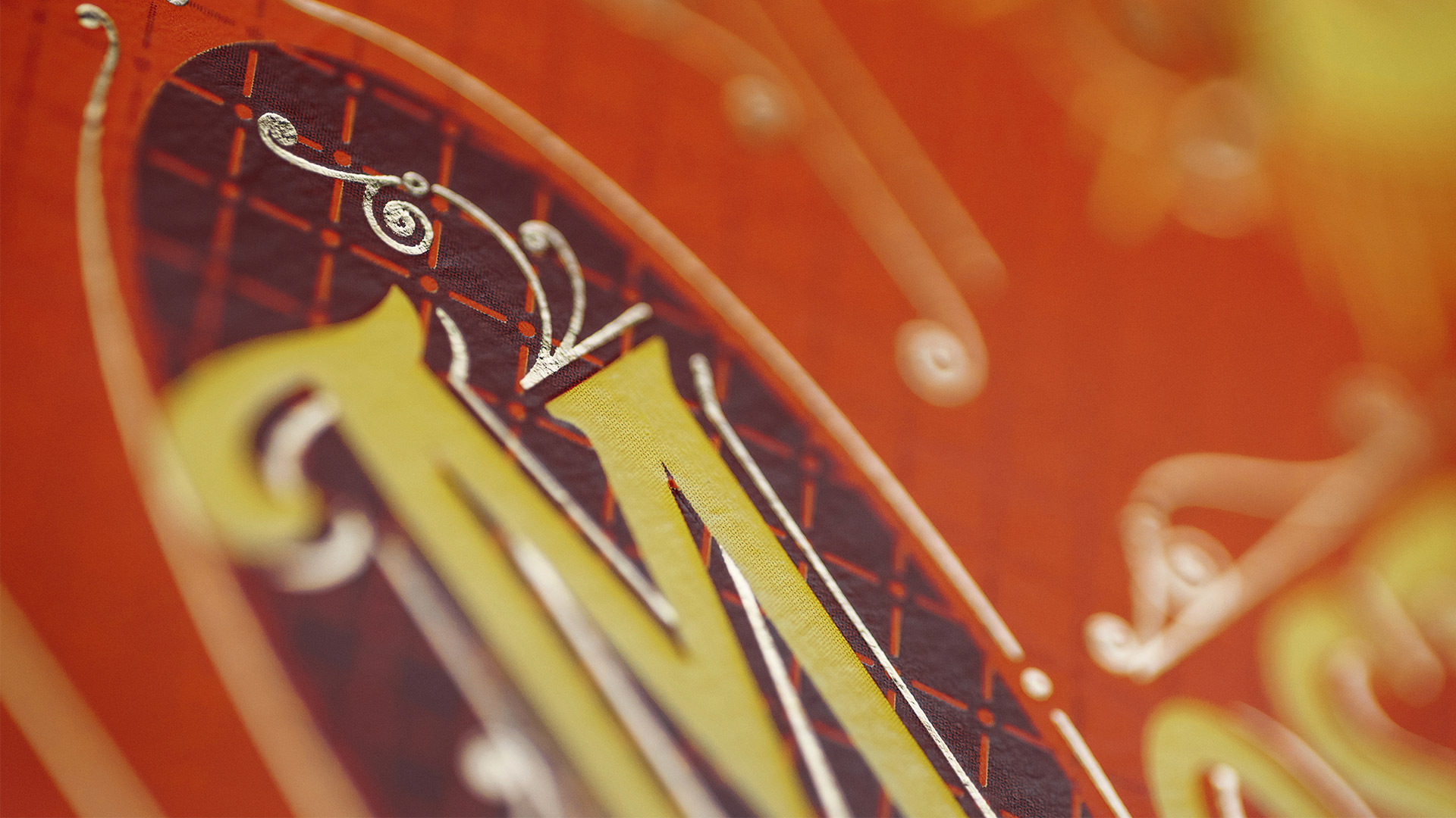
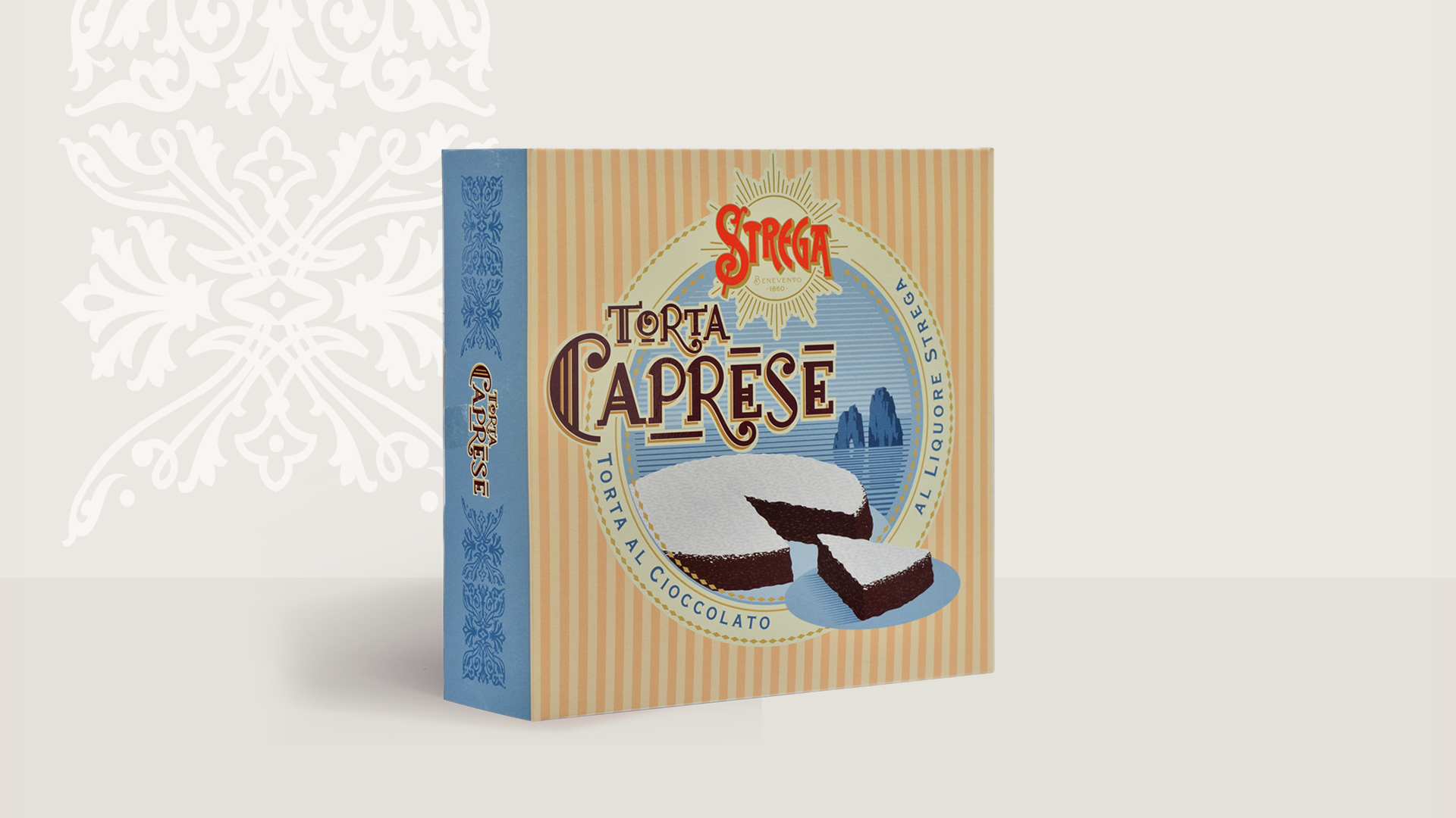
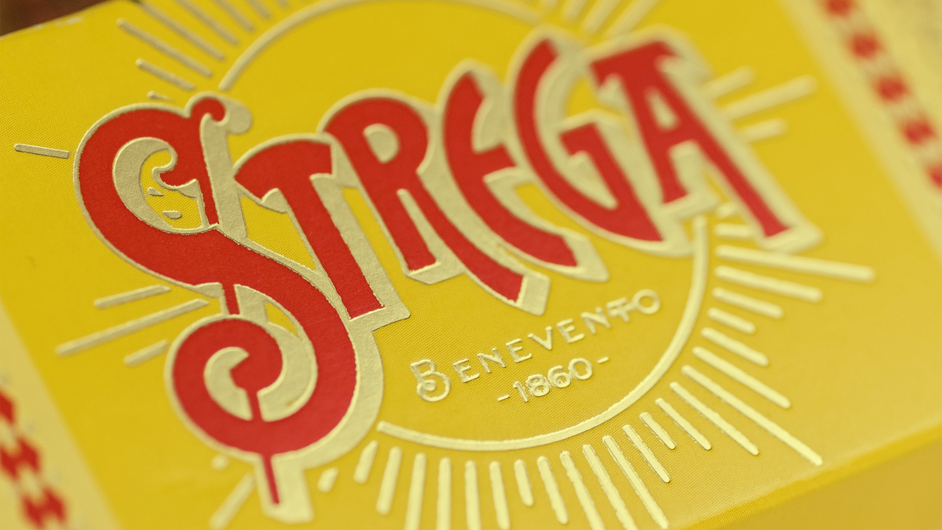
All Strega confectionary products feature silkscreen-printed gold foil touches, as well as the logo with the radial rose window that has made the original liqueur an icon of graphic design. Within the range, Torta Caprese stands out with its 1950s-inspired graphics, with Capri’s blue sea and the famous “faraglioni” (sea stacks) on the horizon. All in all, rich and intense sweets called for opulent packaging, which brings the company’s history back to life and conveys the brand’s care for genuine ingredients and traditional processes.