As part of a long-standing collaboration with the brand, Angelini Design had already created the packaging for Strega confectionary, which stands out with its bold liqueur-infused flavor and rich visual style.
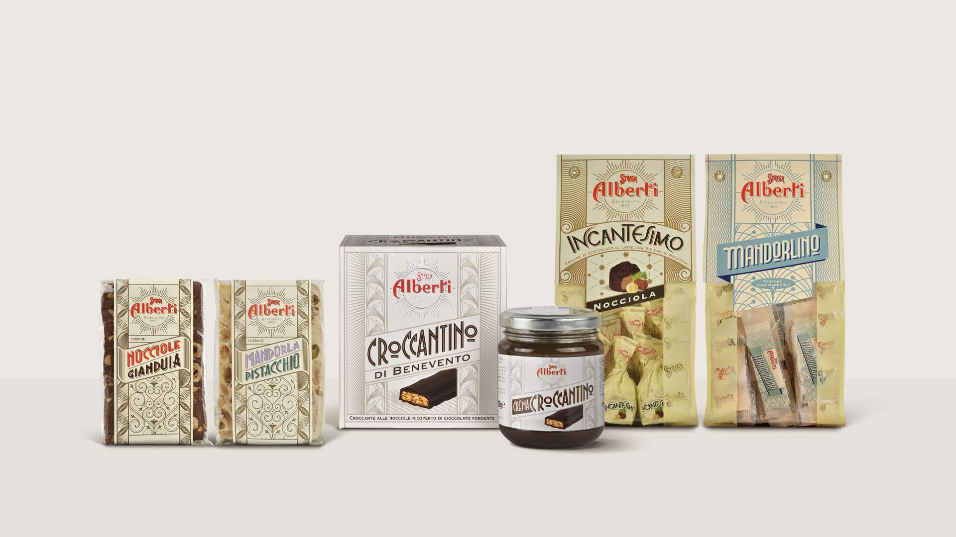
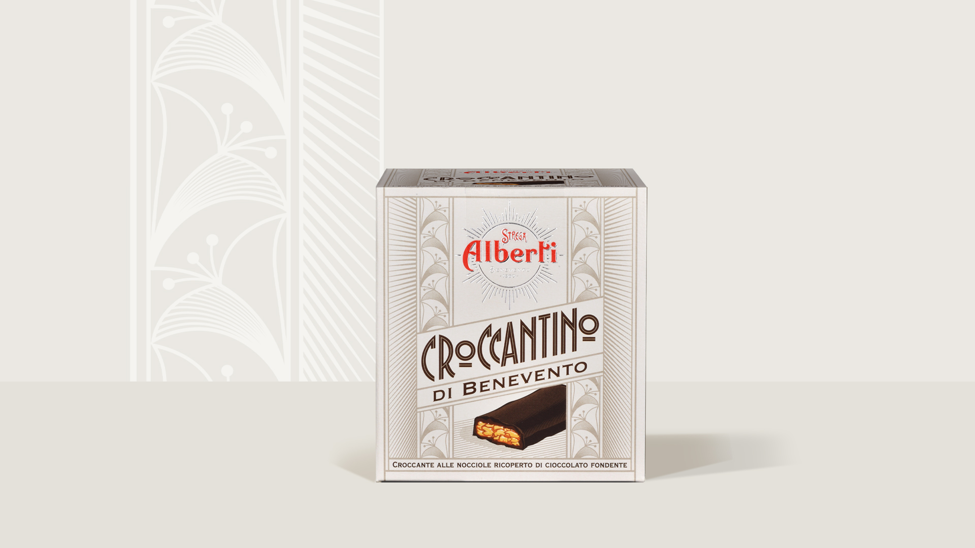
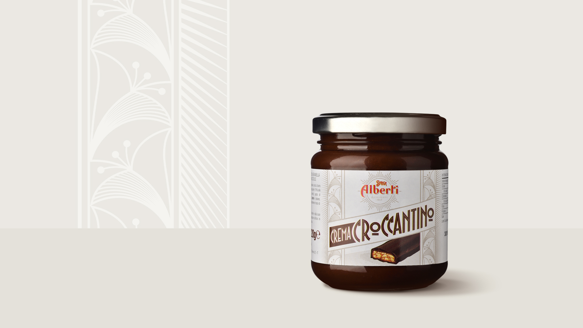
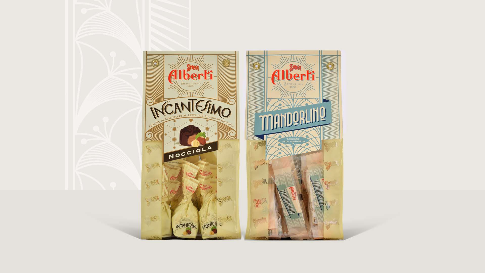
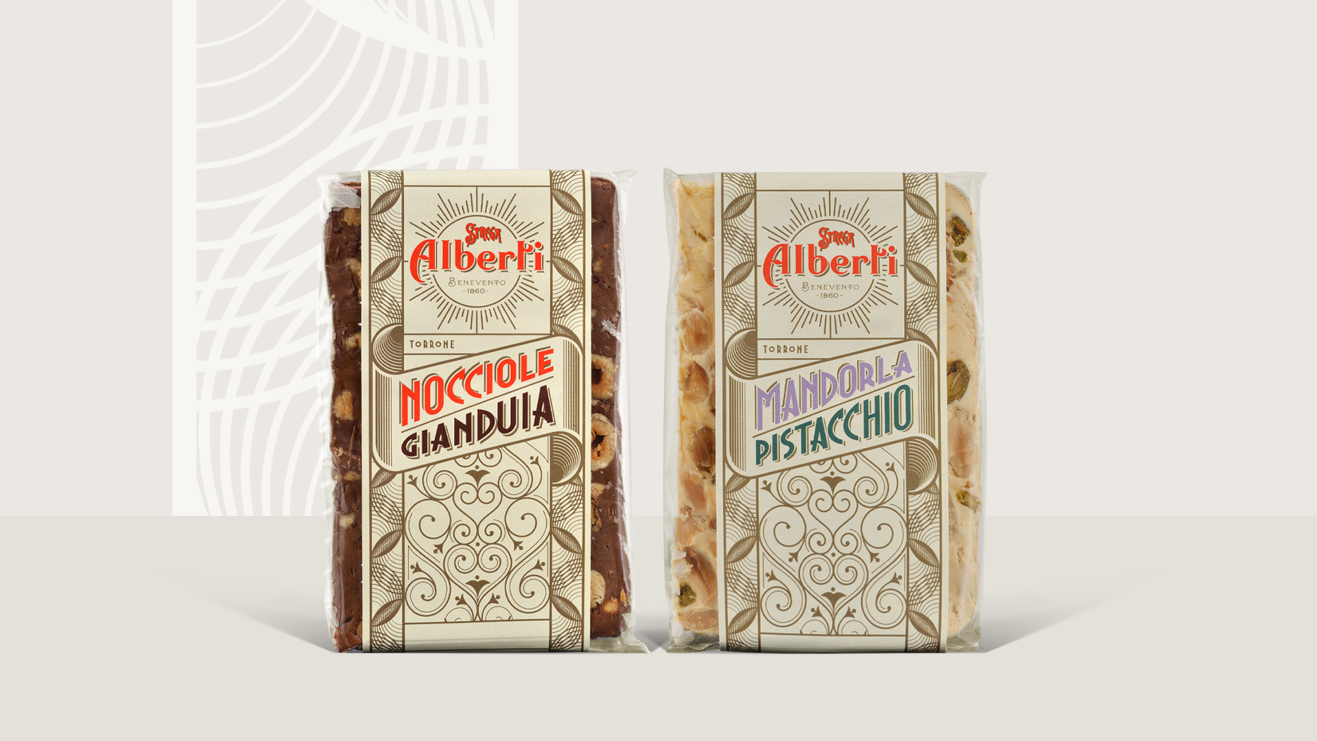
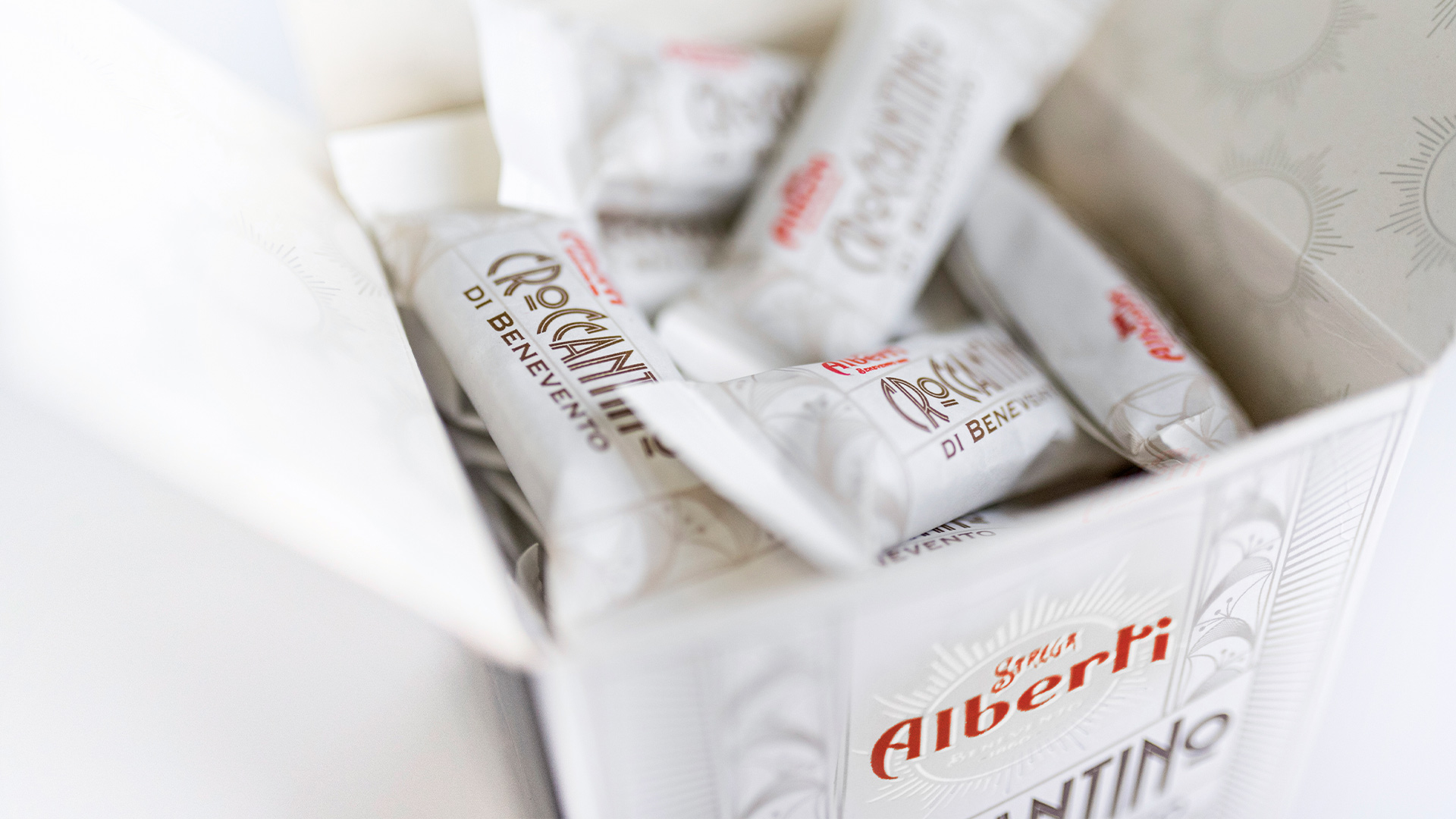
More recently, the agency was entrusted with the company’s second range of sweets, Alberti: a selection of classic and delicate pralines, brittles and nougats. Packaging in this case was designed to evoke a more poetic and light image compared to the well-known Strega range. Thus, both product families have a strong character, but reveal a different soul – like parallel universes stemming from the same DNA.
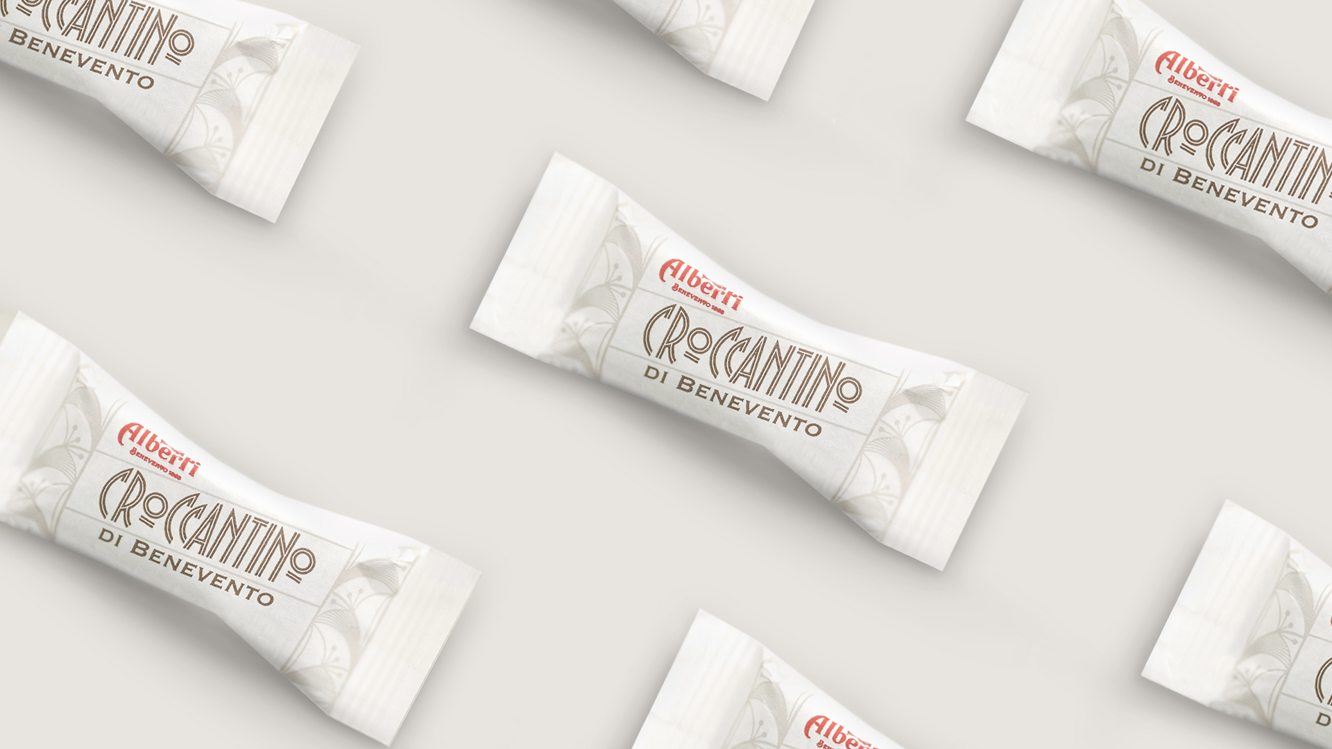
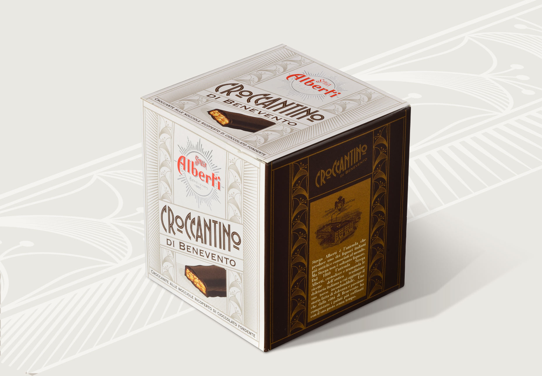
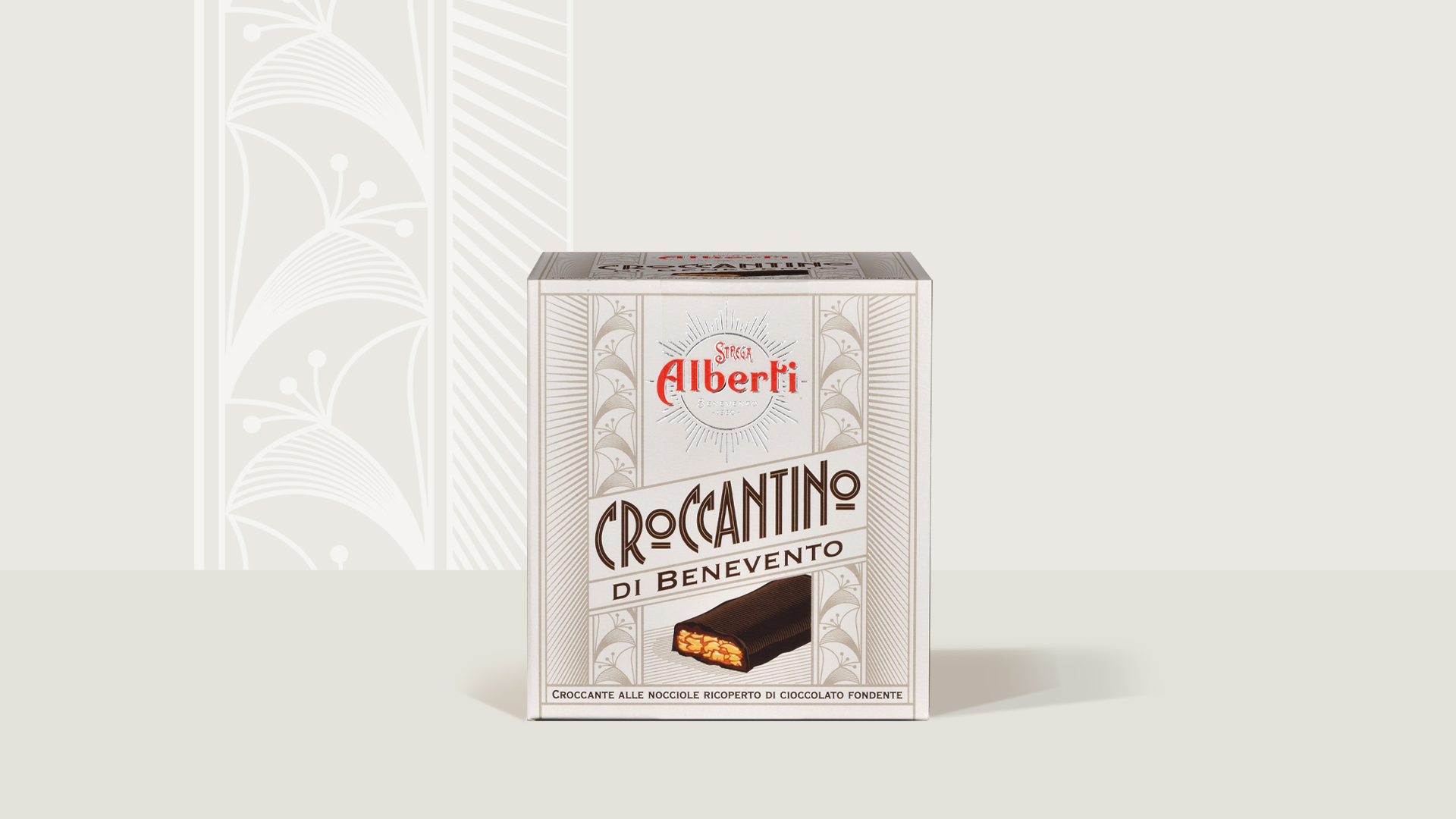
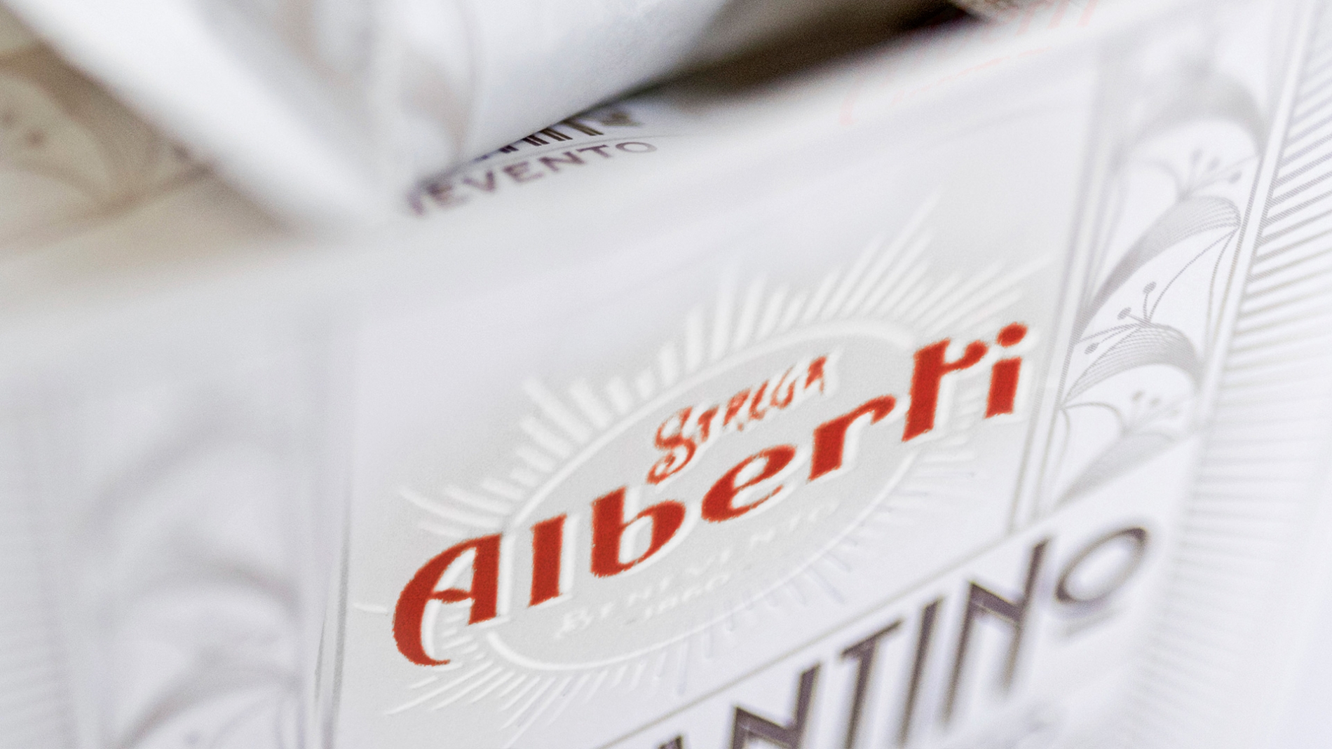
The design for the Alberti range was clearly inspired by Art Deco. Angelini Design carefully defined every single letter on each box, striving to build a completely new character. Visuals were interpreted like paintings, to create a new world that could still fit in with Strega’s historical heritage. The biggest challenge in this case was to add personality and a sense of renewal, while still keeping the spotlight firmly on tradition – the real feather in the cap of a brand that has written a page in the history of Made in Italy.
On the packaging’s neutral color palette, details were printed with silver foil to add a touch of preciousness to objects that are part of consumers’ daily life, yet can represent a prized coffer full of delicious treats, made with excellent ingredients.